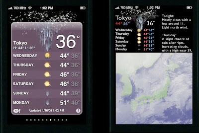
Design guru Edward Tufte has posted a short presentation where he describes the pros and cons of the iPhone interface (warning: it’s a big download).
Basically, he likes the scrolling navigation panes, which he calls “sliding across displays on one surface,” and minimalist controls. However, he dislikes the “cartoony” stock app, which he claims is at the resolution of Excel or PowerPoint instead of the resolution of images. He essentially repeats this critique for the weather app (what I assume is his redesign of the weather app is on the right in the above image). He sums up by stating that clutter and information overload are not attributes of information, but rather failures of design, failures which shouldn't be solved by removing information.
There isn’t a lot new here for iPhone and Tufte fans, but the presentation is interesting and a good description of the pros of the iPhone interface.
via O’Reilly Radar
Tuesday, January 29, 2008
Edward Tufte on the iPhone interface
Subscribe to:
Post Comments (Atom)
No comments:
Post a Comment